Mastering Cloverleaf: Elevate Decision-Making in Your Insurance Business by Mastering Analytics Dashboards
We’re in an age where insurers depend on the depth of quality insurance insights that are delivered quickly to protect from risk, increase growth, and boost profitability. If you’re an executive presenting a new strategy or an employee presenting to senior executives, either way the value of the data can make or break the success of the insurance business. This is why I’m so passionate about helping insurers refine the precision and power of their insurance data analytics dashboards.
The Cloverleaf platform is built for technical and non-technical insurance professionals alike. This blog post is aimed at helping your company share interactive reports with ease. Let’s dive in!
Setting the Stage for Dashboard Excellence
Building a dynamic impactful dashboard is a lot like an artist starting with a blank slate and painting a masterpiece. The first step in your journey starts with the Presentation module. This is where you customize the theme, layout, and canvas size of your dashboard to aid in data-driven storytelling.


Once your foundation is set with the type of presentation that will captivate your key stakeholders, you can determine the type of analytics functionality will populate your dashboard. For example, you can seamlessly feature Discovery visualizations or Tabulations reports on your canvas. The flexibility of our platform allows insurance professionals to mix and match the types of models that are included in a single canvas.

Let the Storytelling Begin!
While it is great to be an expert in technical detail or data analytics, without communication skills to bring information to life, you risk never capturing your audience’s attention and therefore missing an opportunity to influence key stakeholders. This is what makes the Slides function so crucial as it helps provide a structure that enables insurers to be effective communicators to drive home key messages from their data.
Stressing the flexibility of the Cloverleaf platform again, the Presentations Module allows the development of as few or as many slides as a user needs. Here are some key functions of this module to keep in mind:
- Add new slides: Use the slide panel on the right to build out your narrative.
- Customize each slide: Right-click to rename, duplicate, copy, or delete slides as needed.
- Make it visually compelling: Edit your cover and content slides to keep the audience engaged.

Uplevel Your Dashboard with AI
The AI capabilities in our platform will make you fall in love with our Speech Insights feature. If you enjoy the convenience of smart devices that you can speak with and in seconds receive your desired information or outcome, then you’ll be at home with this. Located at the bottom of the screen, simply click the button, speak your dashboard requirements, and voilà—your presentation is ready in seconds!


Think of our Speech Insights feature as your trusted assistant that can make you smarter by enabling you to quickly modify presentation details, slice data in multiple ways, or add more smart insights.
Having Trouble Being Concise? Mini-Tabs Can Help.
Once you’ve automated insights, organizing them effectively is key—Mini-Tabs make that easy. For those presentations packed with rich insights, the Mini-Tabs feature enables users to display multiple data visualizations on a single screen – one table at a time. It works just like switching between Internet browser tabs, letting you focus on one insight at a time while keeping everything organized.
Here’s how it works:
- Find the tab icon in the canvas menu.
- Add your discoveries: Drag and drop visualizations into each tab.

- Customize tab features: Right-click to rename, delete content, adjust order, or reposition tabs.

Instead of drowning your internal customers in information use Mini-tabs to stay organized, clean, and crisp while providing deep data insights.
Slicers at Even Further Data Filtering Capabilities
This real-time analytics function enables technical and non-technical users to drill down into various reports with ease.
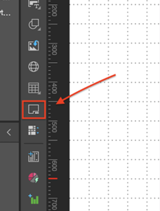
How to Add a Slicer:
- Click the slicer icon in the canvas menu.

- Select the database and choose your hierarchy for filtering.

- Right-click the slicer to access formatting and settings options.

Slicer Settings That Matter:
- Custom Titles: Rename slicers for clarity.

- Slicer Type: Choose dropdowns, checkboxes, or other styles.
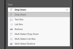
- Load Time Settings: Decide what data loads automatically.
- Search Options: Filter data by contains, starts with, or exact matches.
- Non-Empty Filter: Hide empty values for a cleaner look.
Final Thoughts: Your Dashboard, Your Rules
Dashboards really are a means to showcase the performance of your business and how it is serving the insured. You can design a dashboard that is visually compelling like an artist, easy to navigate, and packed with real-time insights. Whether you’re creating a one-off presentation or an in-depth reporting system, Cloverleaf Dashboards ensure your data works for you—not the other way around.
Check out our Platform section for more details on our services.