
Taylor’s Corner: LEAP into the Present
The Present module gives users the ability to create, customize and design presentation or ‘dashboards.’ Besides simply adding or dragging your reports onto the canvas (as shown below). There are a few tips and tricks to help customize and use Present to it full ability for your advantage.
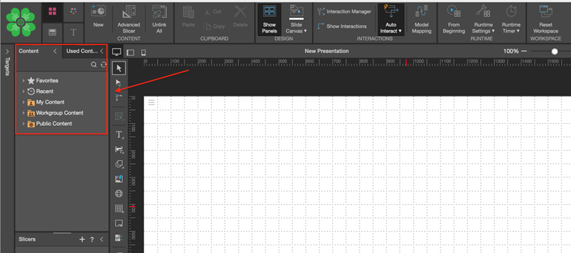
Select any of your discoveries to add to the canvas from the ‘Content’ tab.
Slides and Tab
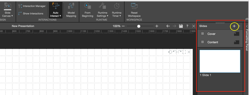
Your presentation can have more than slide. Using the slide panel on the right side of the screen (red highlight), users can add (yellow highlight) or remove slides, choose to have a cover or content slide or format each slide further.
By right-clicking on any slide, further formatting options become available. Users can rename the slides, duplicate, copy or delete slides and etc.

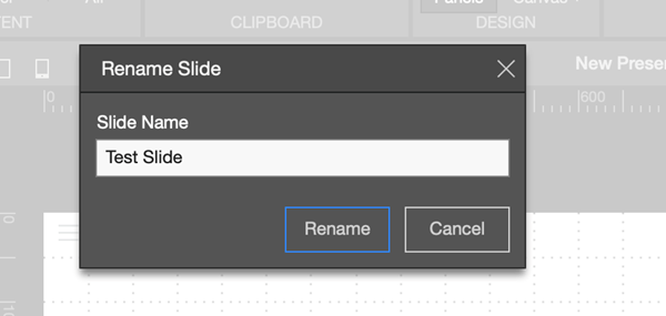
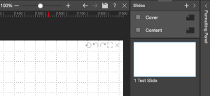
For example, after clicking ‘Rename Slide’ the panel opens and I will change the name to ‘Test Slide’ and click ‘Rename.’ The new slide name appears below the slide.
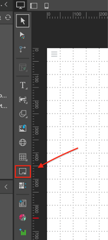
Tab or ‘Mini-Tabs’ can be added to presentation to display multiple discoveries or visualizations and in the same screen. A single discovery can be added to each tab and a single tab will be displayed at a time.
The tab icon can be found from the canvas menu.
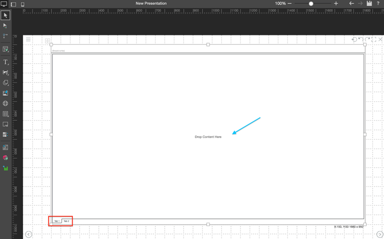
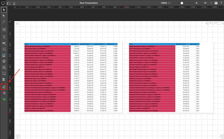
Once you have you tab added to the canvas, you can select which tab you want to work on (red highlight). In that tab, similar to adding to a regular canvas, you can drag and drop your discoveries (blue highlight) to the corresponding tab of your choice.
After adding your discoveries, right-click on your tab to further expand the mini-tab custom features.
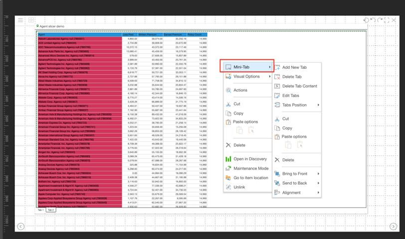
From the menu, the following features are available:
- Add/delete the current tab.
- Delete tab Content – Remove the discovery from the current tab.
- Edit Tabs – Opens the ‘edit tab’ panel where tab name, appearance and order can be adjusted.

- Tab Position – Give the option to display the tabs at the top or bottom of the canvas, or hide the tabs.
Slicers and Interaction Manager
Slicers can be added to your presentation to filter data from the discoveries. Slicer icon can be found from the canvas menu (red highlight).
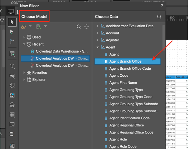
After clicking the slicer icon, the ‘new slicer’ panel will open. From there, user can select the corresponding database to choose their desired attribute to filter by.
For this example, I’m going to filter the agent reports by ‘Agent Branch Office.’
Once slicer is added, right click to open further slicer settings. This menu gives the user the option to format the slice (text font, size, color) or open the slicer settings panel.
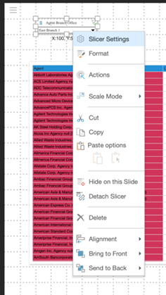
With the ‘Slicer Settings’ panel open, further customization of the slicer can be done.
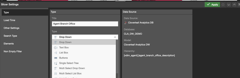
Below are features available in the slicer settings panel:
- Title – Change title of the slicer.
- Type – Select the filter box type.
- Load Time – Select which of the slicer’s elements will be automatically loaded when the report is opened.
- Other Settings – Select slicer elements limit
- Search Type – Select if the slicer search will either contain, not contain, start/end with or be exact.
- Elements – Select which element you want in your slicer. By default, all are selected
- Non Empty Filter – Hide the empties from the slicer.

Once your slicer or slicer are added to the canvas, users can select the ‘Show Interactions’ icon (red highlight) from the slicer formatting banner.
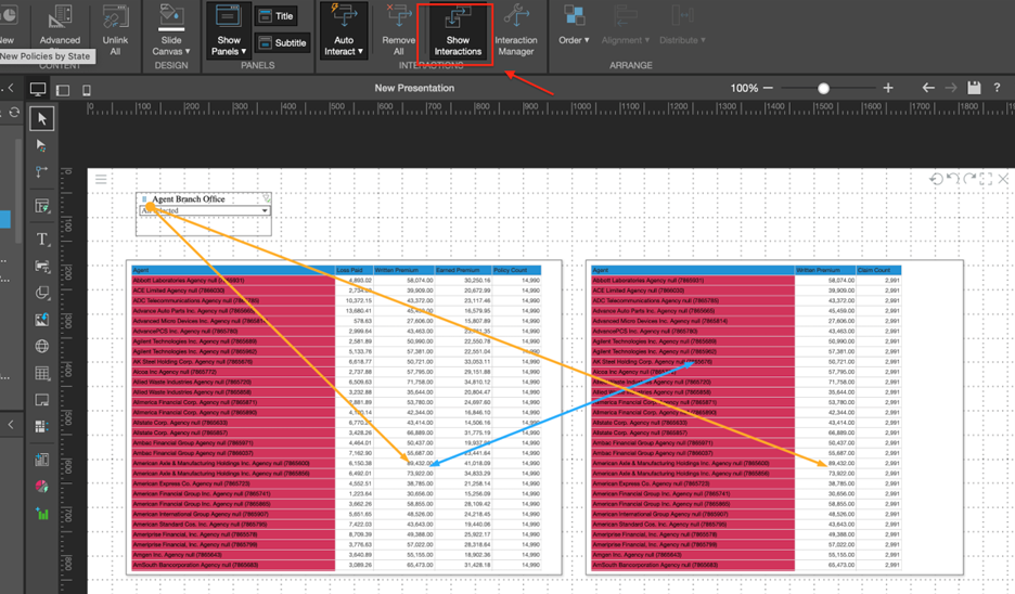
The ‘Show interactions’ features is showing that right now the slicer is interacting with both discoveries and that the discoveries are interacting with each other. If you’d like your slicer or slicers to only interact with a specified discovery, that can be adjust by clicking on the ‘Interaction Manager’ icon (green highlight).

By clicking on the ‘Interaction Manager’ icon, the interaction manager panel opens. From there, users can select which discovery (or discoveries) they want the slicer to filter. In this example, I can select or deselect which of the two reports I would like for the ‘Agent Branch Office’ slicer to filter.
Check out our Platform section for more details on our services.